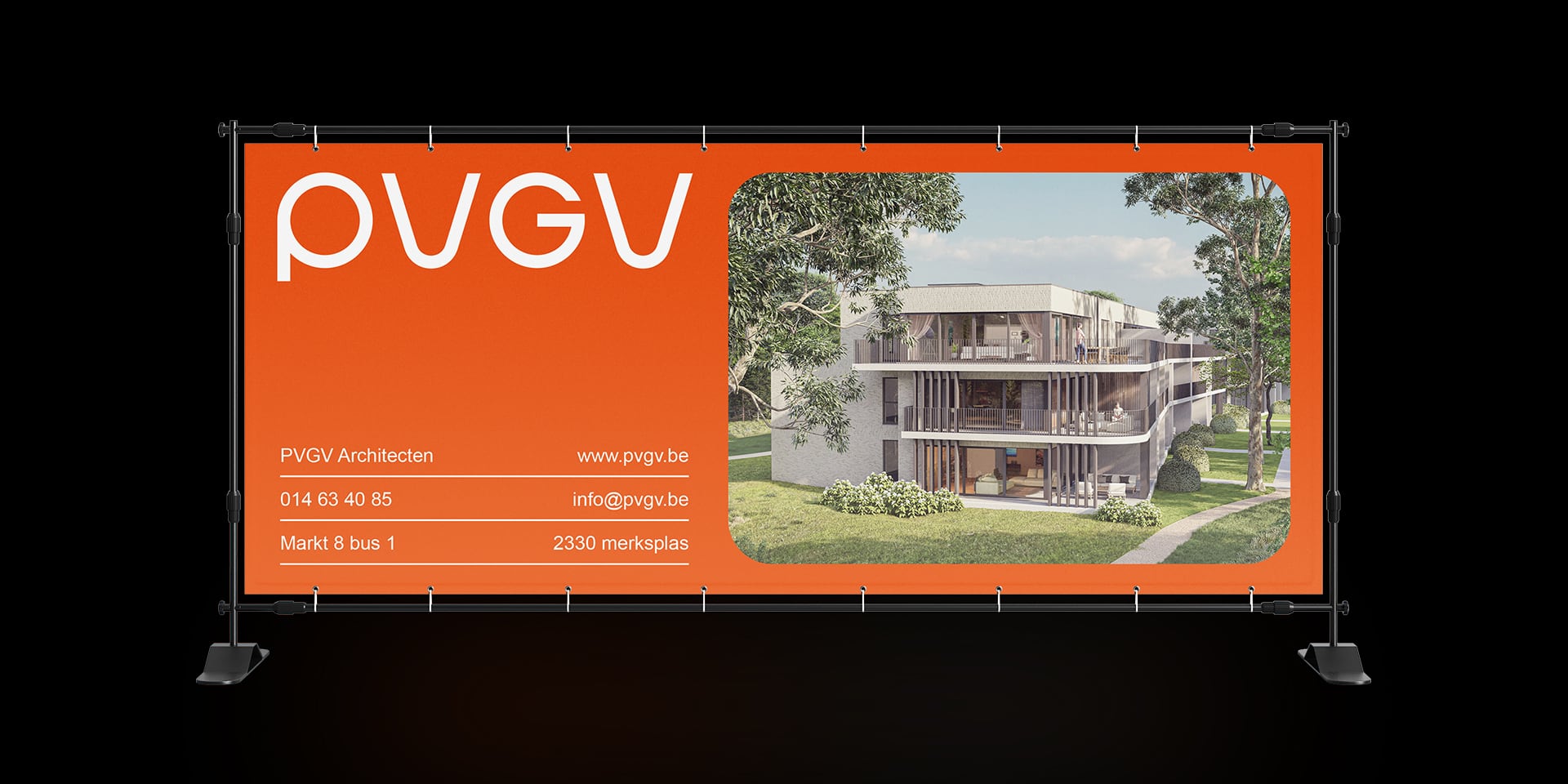
PVGV Architecten
Rebranding
| Year: | 2024 |
| Client: | PVGV Architecten |
| Made at: | culd. |
| Services provided: | Branding, Graphic design, Creative direction |
We had the pleasure of collaborating with PVGV Architects on their recent rebranding and repositioning. As a renowned architectural firm located in Merksplas, they have been at the forefront of architectural design since their establishment in 2000.

The Vision:
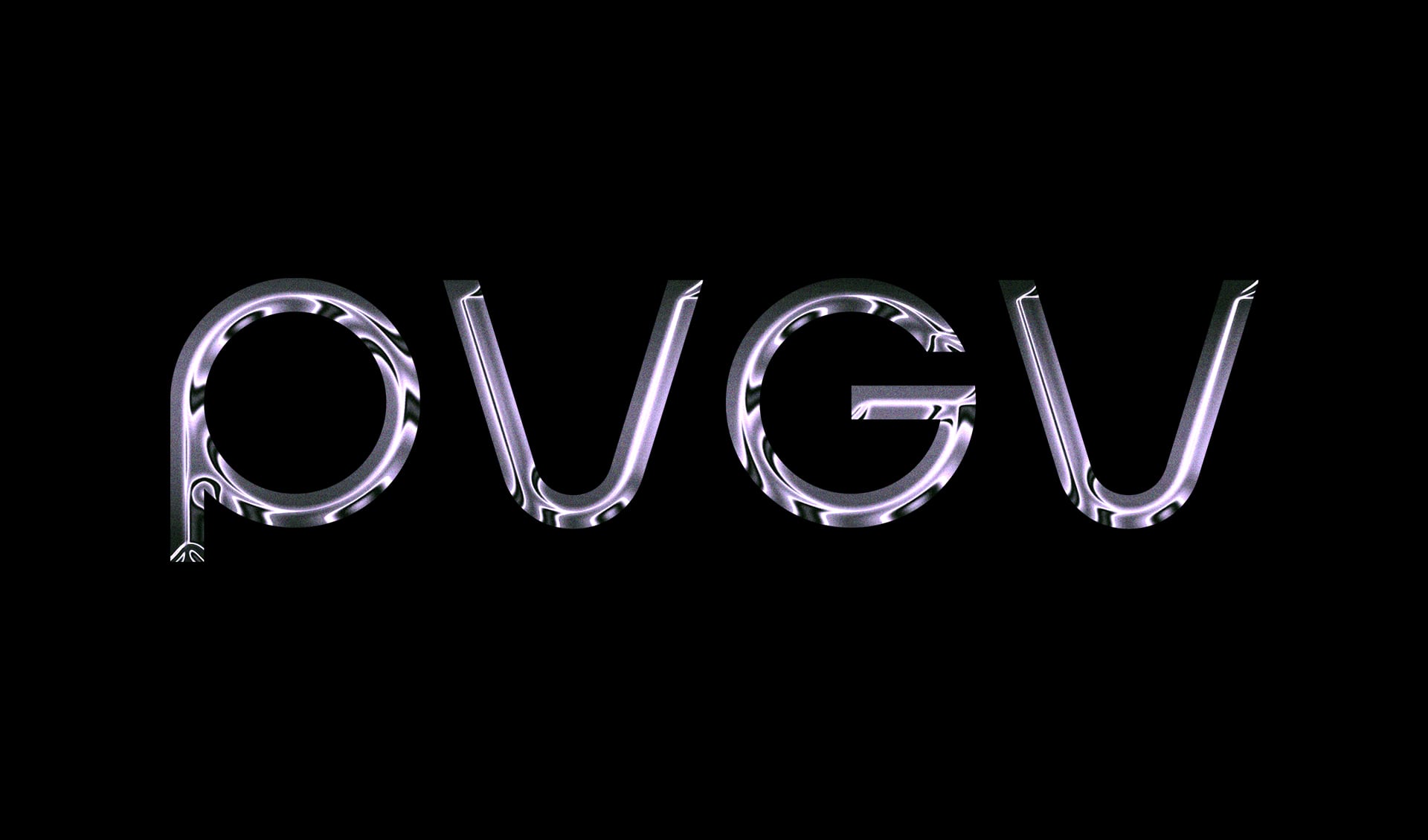
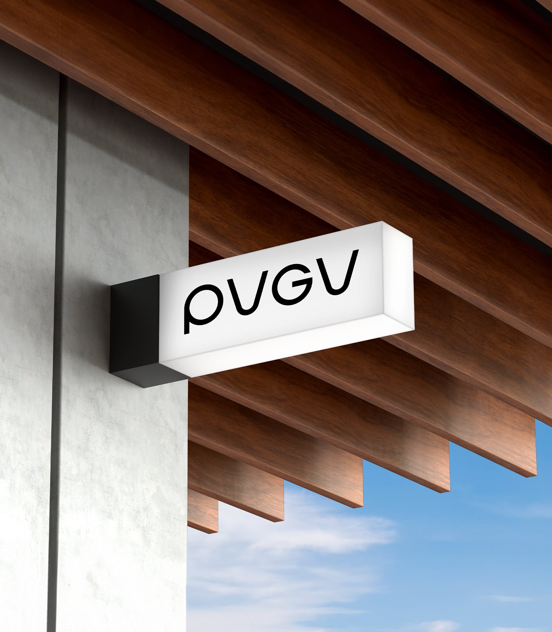
PVGV Architects wanted to refresh and redefine their identity, especially after relocating to a new premises. With a focus on visibility for their new office, we were tasked with creating a new logo and a fresh brand identity.
Creative process:
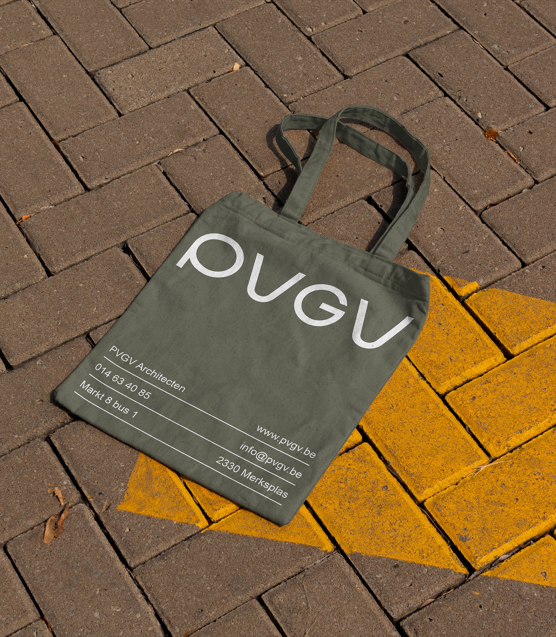
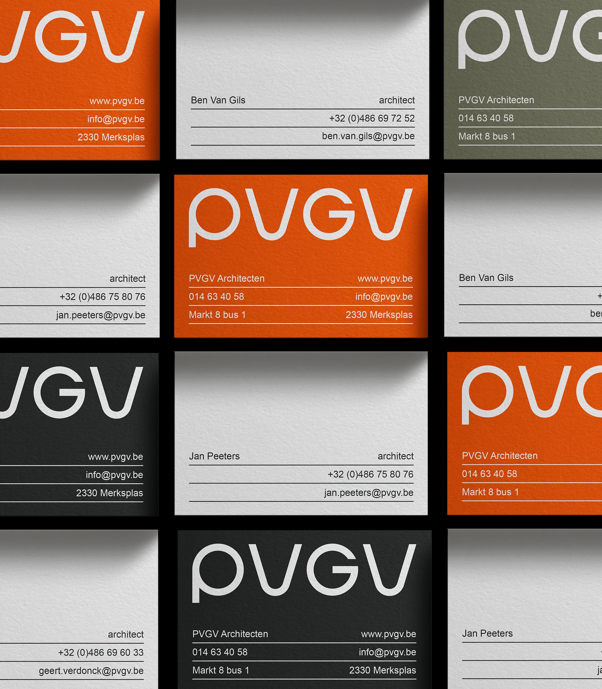
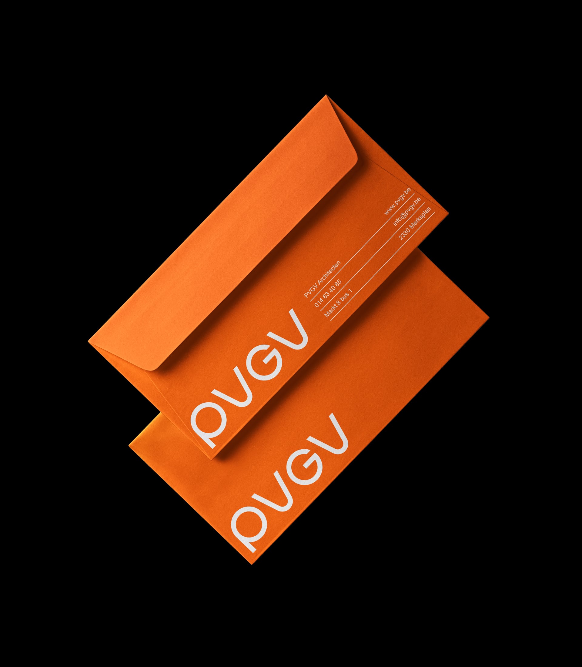
The creative process was guided by specific criteria and desires from PVGV. The style had to be mid-century, with a warm and rounded aesthetic and the addition of the color orange.
In line with the requested warmth and homely atmosphere, the design had to be both businesslike and playful, highlighting the idea that dreams could be realized with the expertise and knowledge of PVGV.
Inspiration:
Ultimately, we found inspiration for the logo in the iconic 1970s NASA logo known as "the worm." This proved to be the perfect blend of the desired mid-century style, warmth, and rounded shapes. The color orange was strategically chosen to stand out amid the often black-and-white identities of other architectural firms.
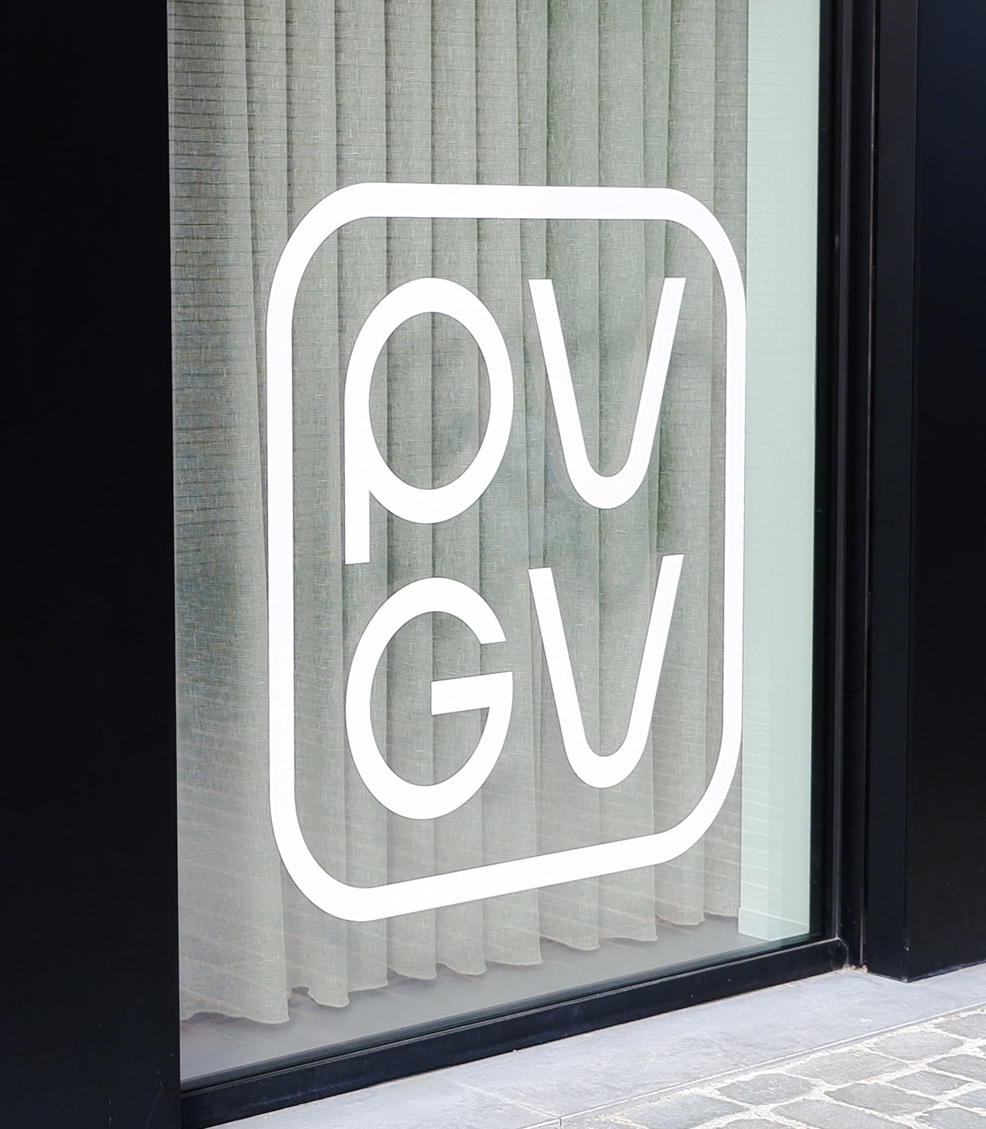
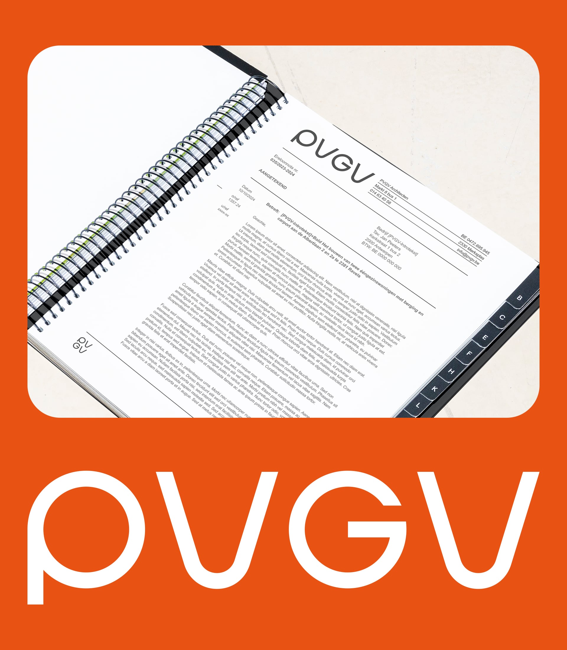
The result is a timeless, recognizable identity that reflects the vision and values of PVGV Architects, while bridging the gap between tradition and innovation. We are proud to be part of this transformation process and look forward to continuing our partnership with PVGV Architects.
