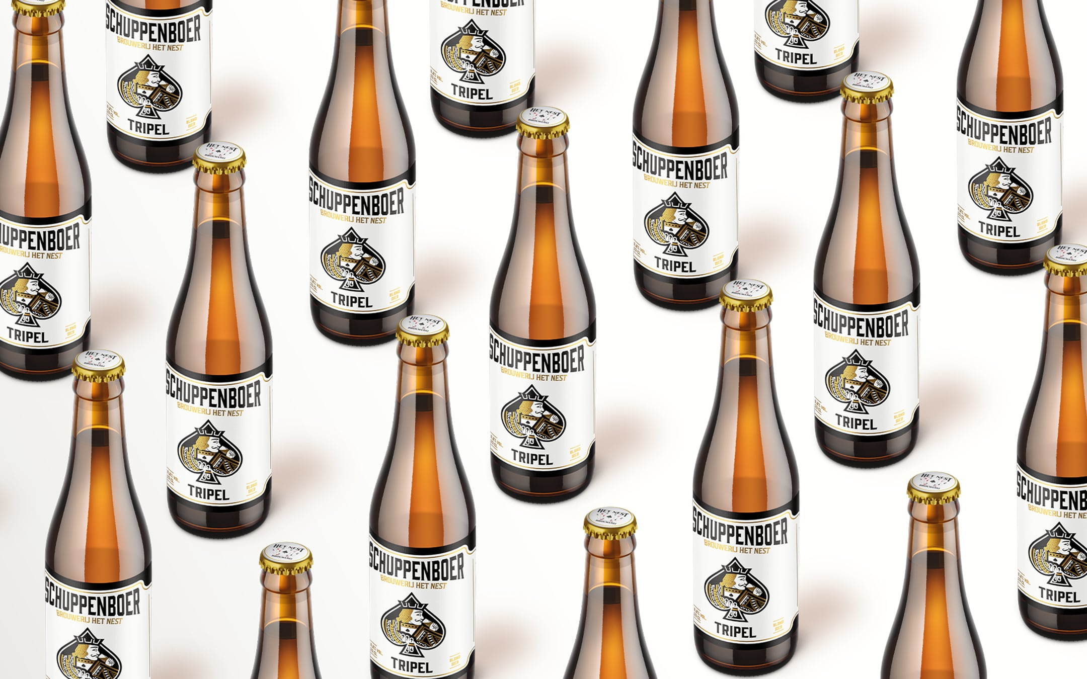
Schuppenboer Tripel
Revitalizing the Schuppenboer Beer Line
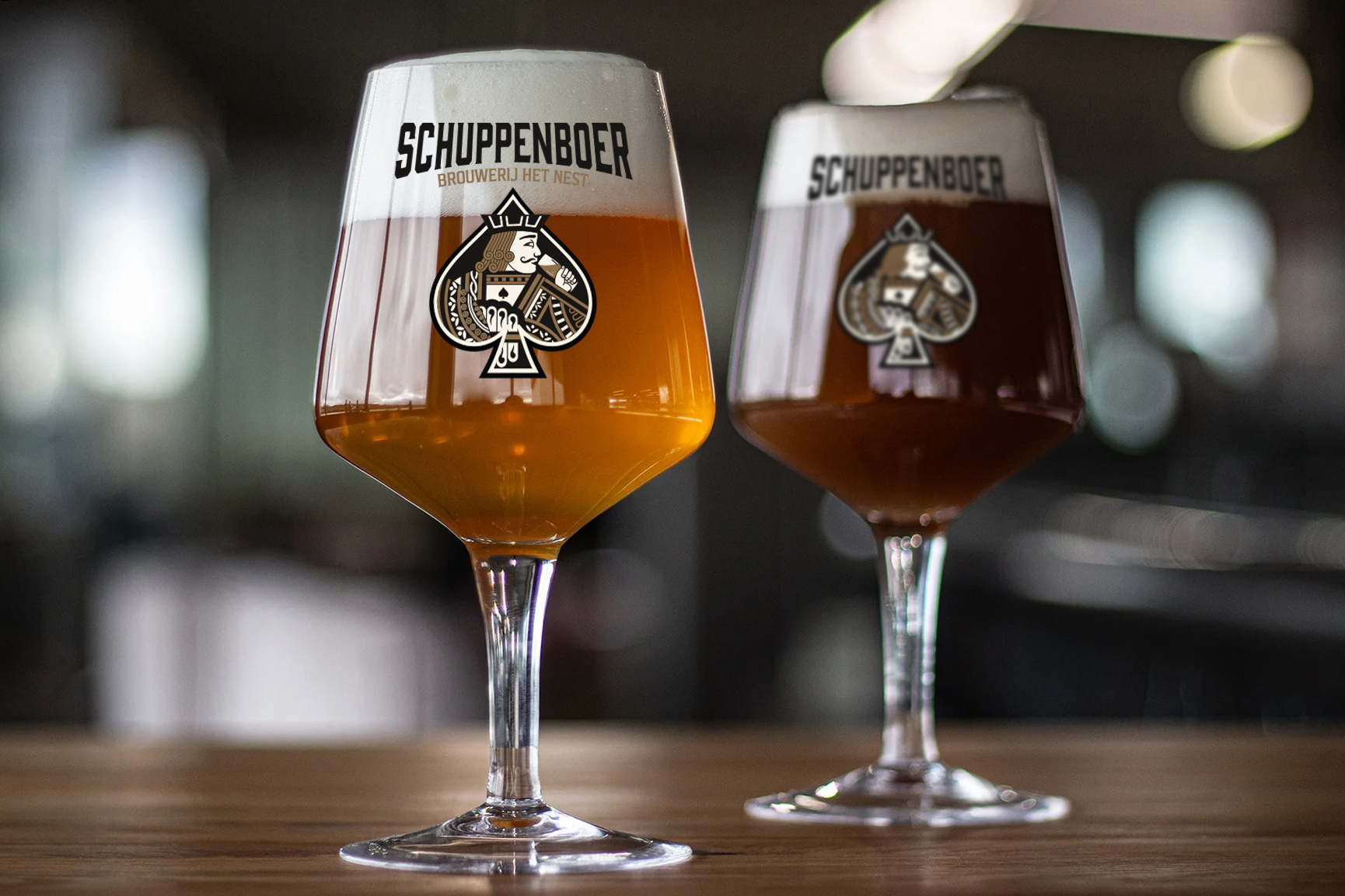
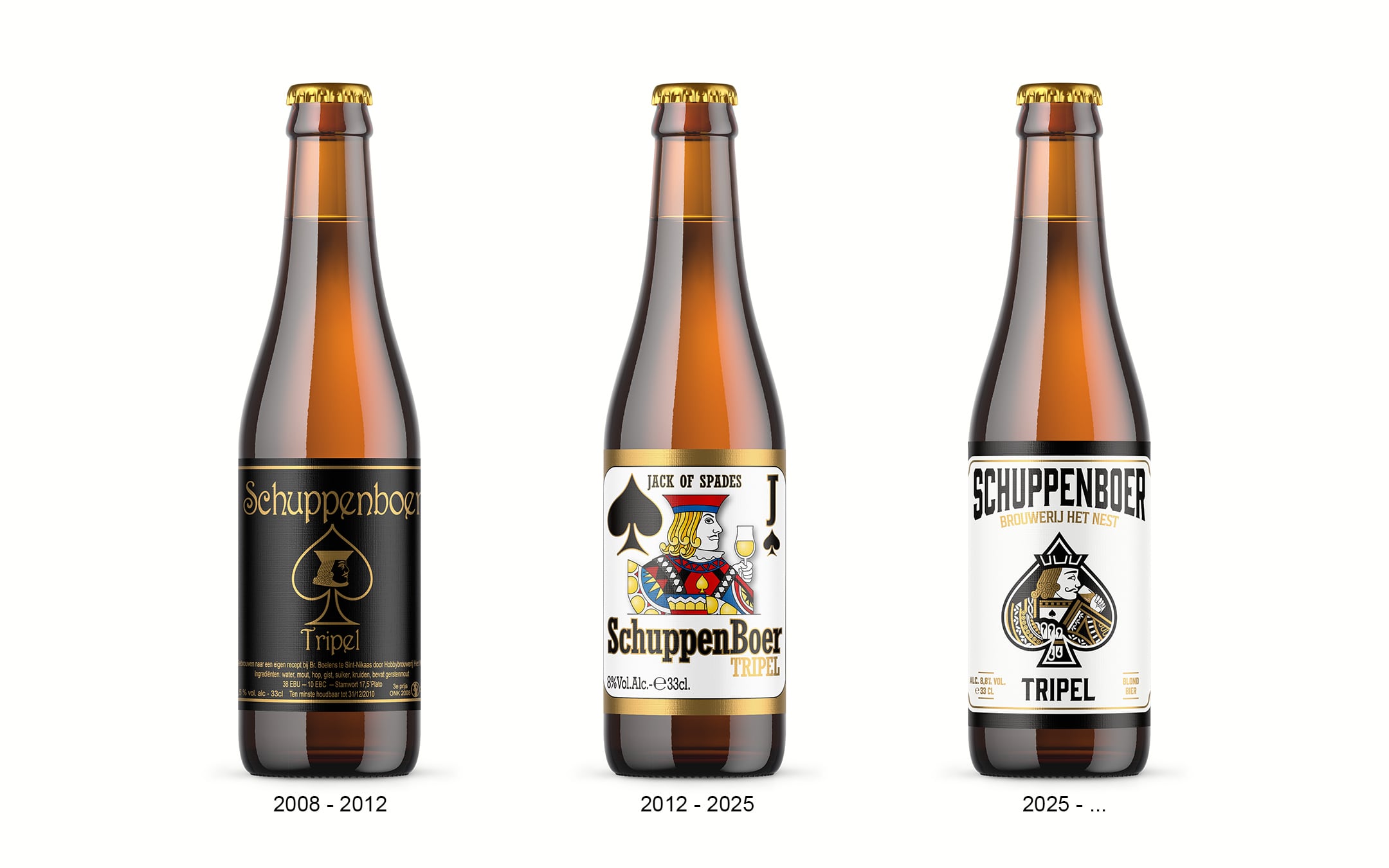
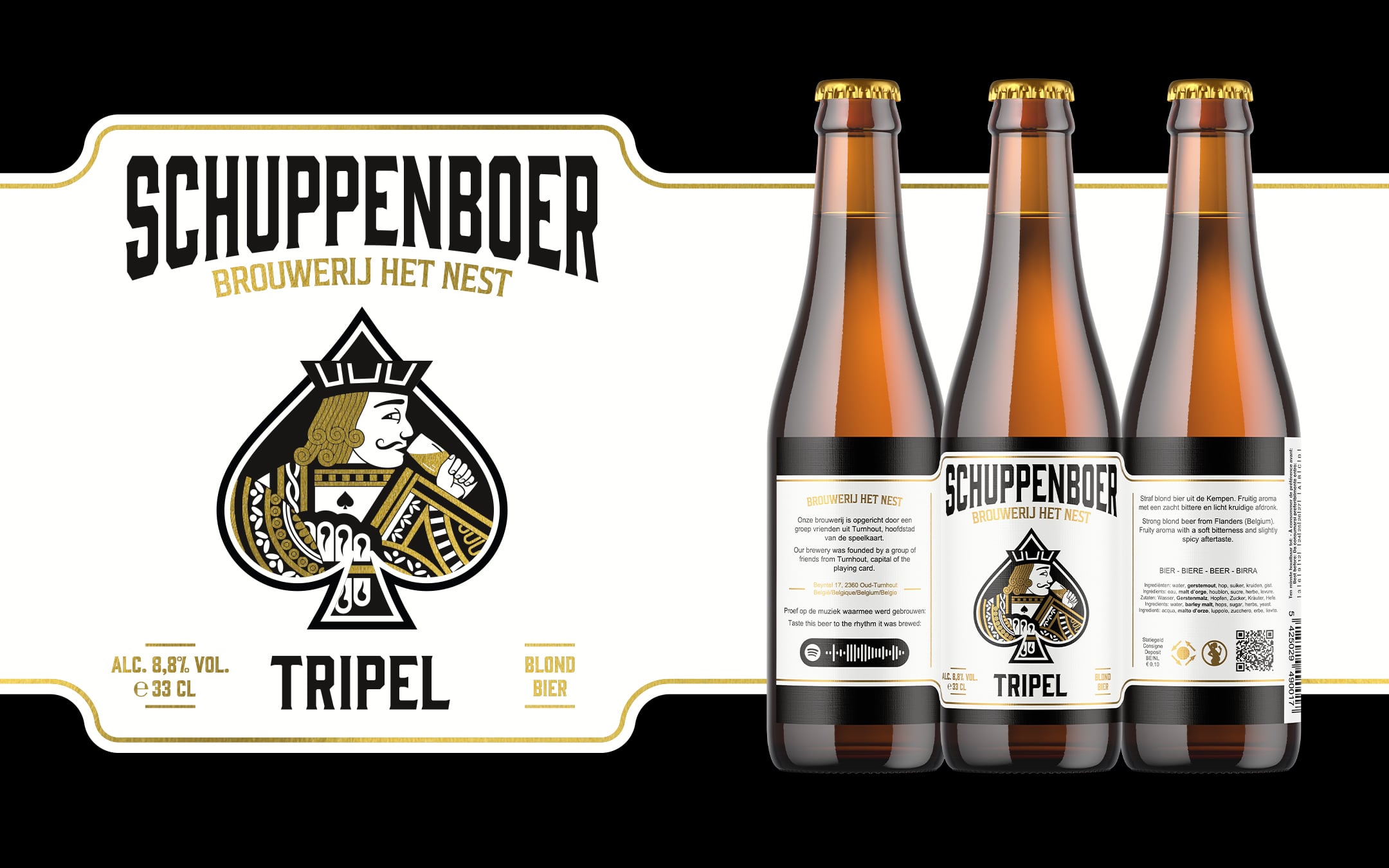
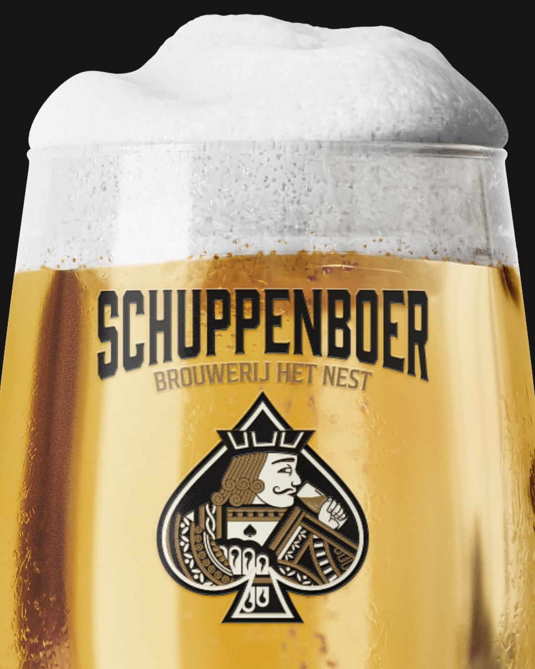
Schuppenboer is one of the most iconic beers from Brouwerij Het Nest, a brewery based in Turnhout a city with a deep-rooted history in playing cards. Originally launched in 2008, Schuppenboer Tripel was the first regional beer of Turnhout and quickly became a household name. As the brewery’s lineup grew, the need arose to refresh and unify the design of its core beers while staying true to its legacy.
| Year: | 2024 - 2025 |
| Client: | Brouwerij Het Nest |
| Strategy by: | Brouwerij Het Nest |
| Made at: | culd. |
| Services provided: | Creative direction, Graphic Design, Packaging |
The Challenge:
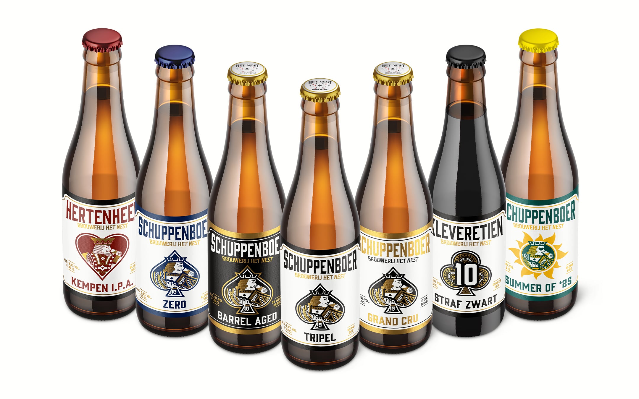
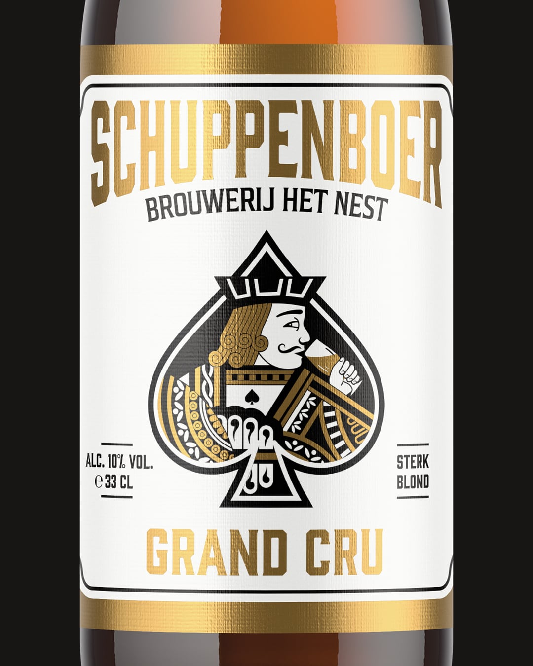
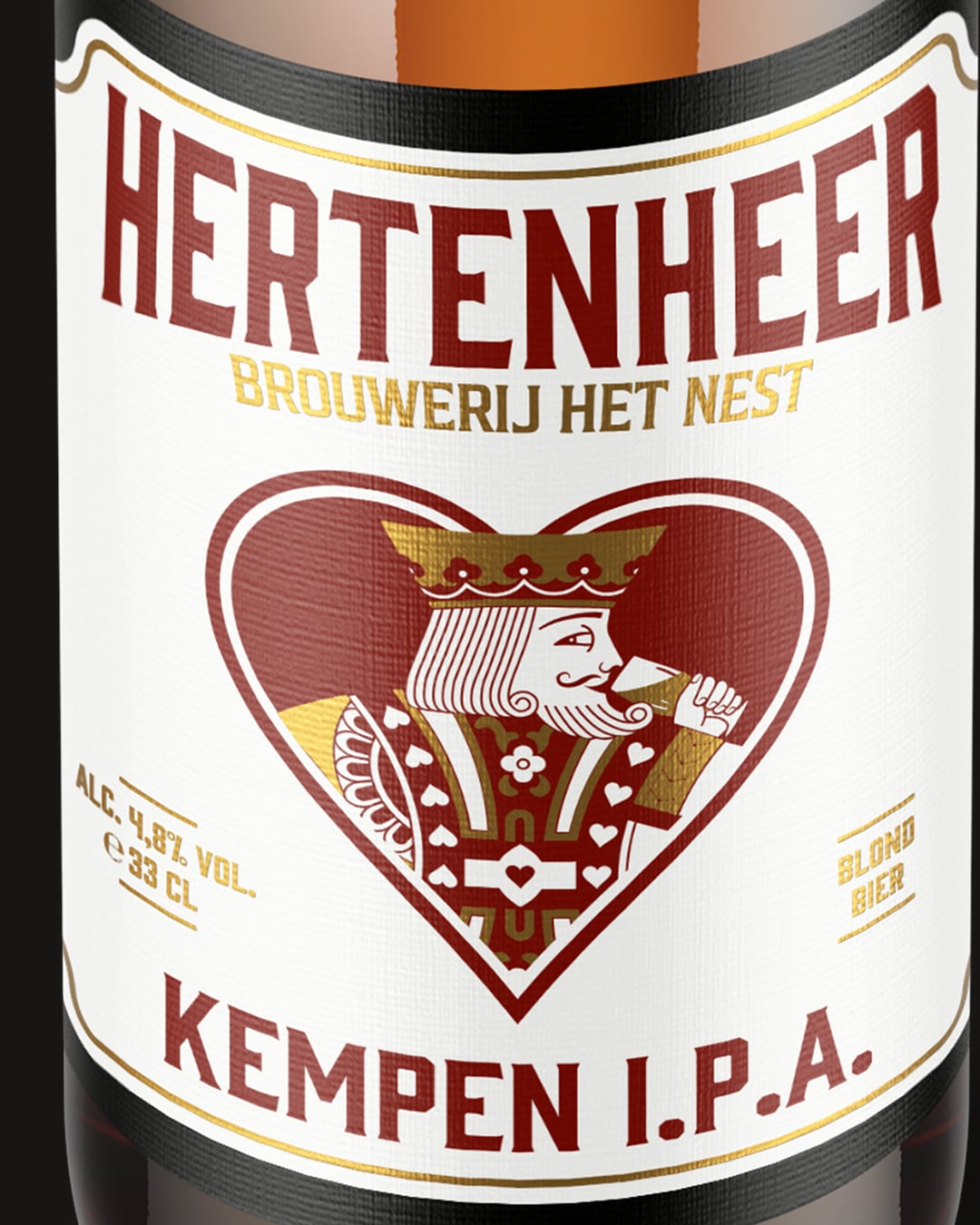
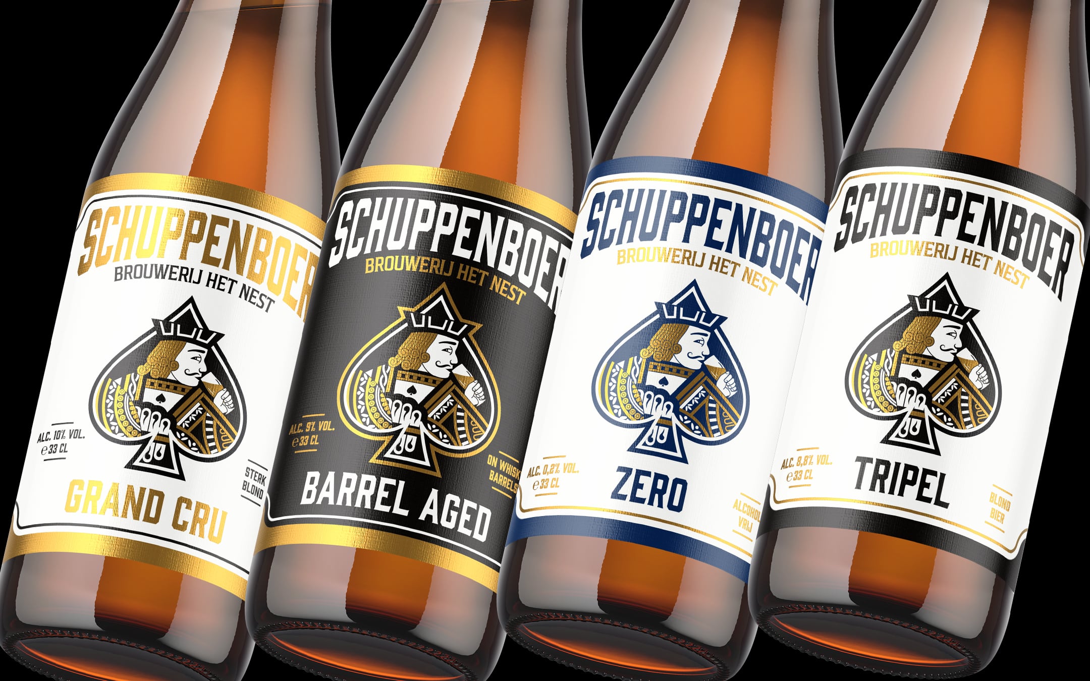
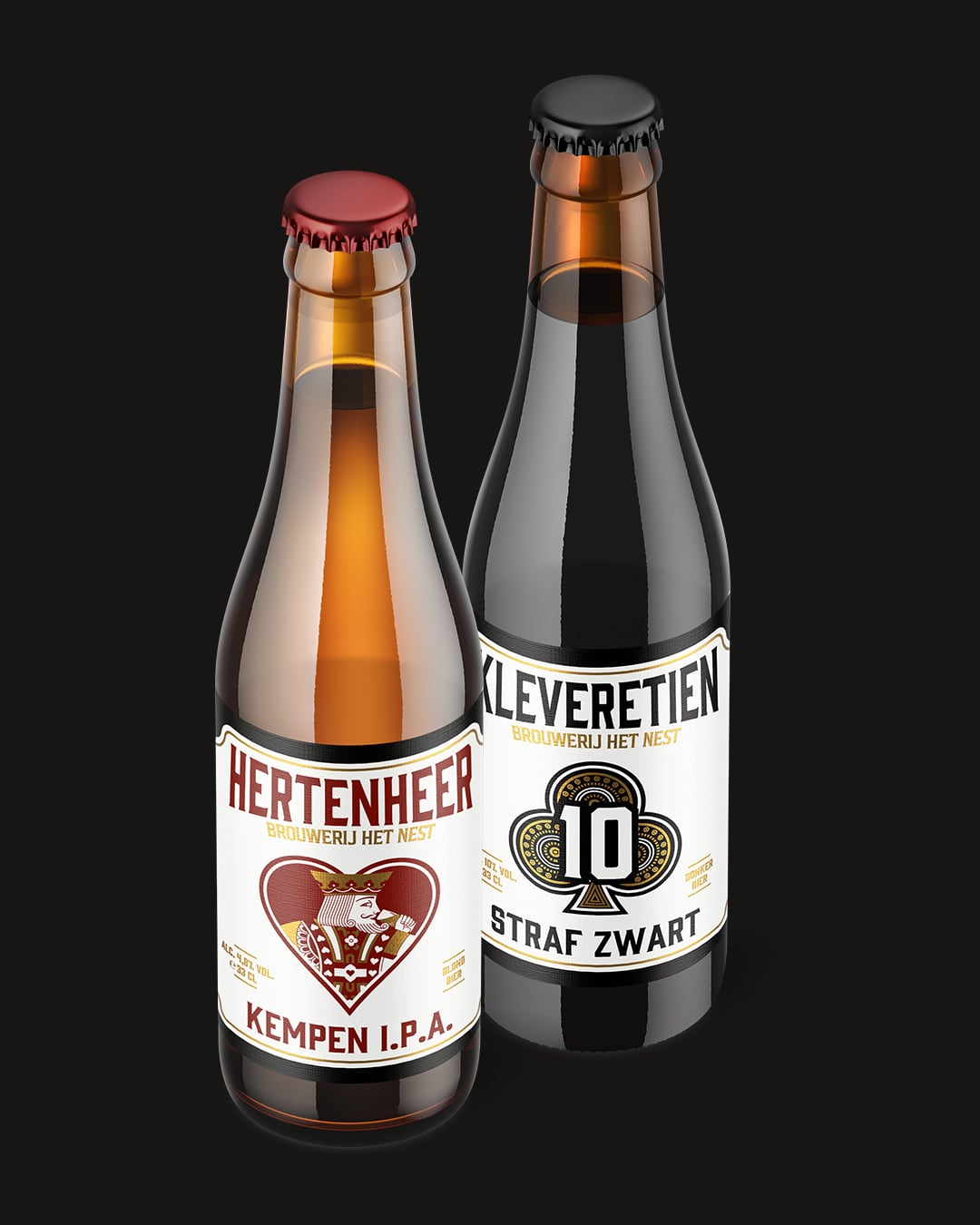
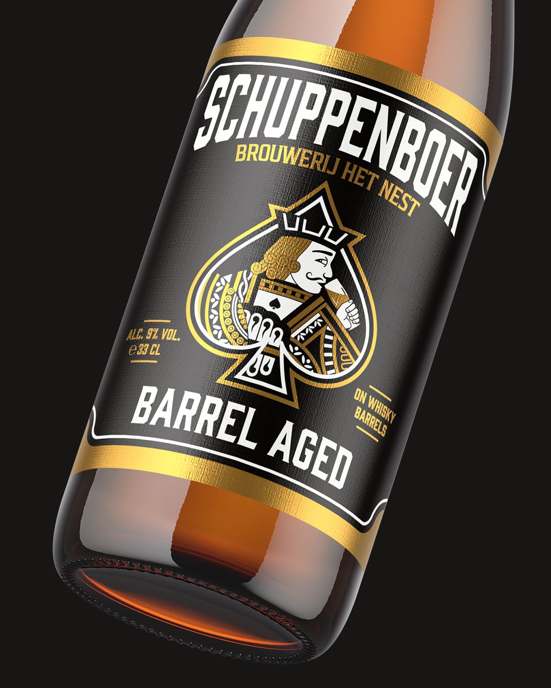
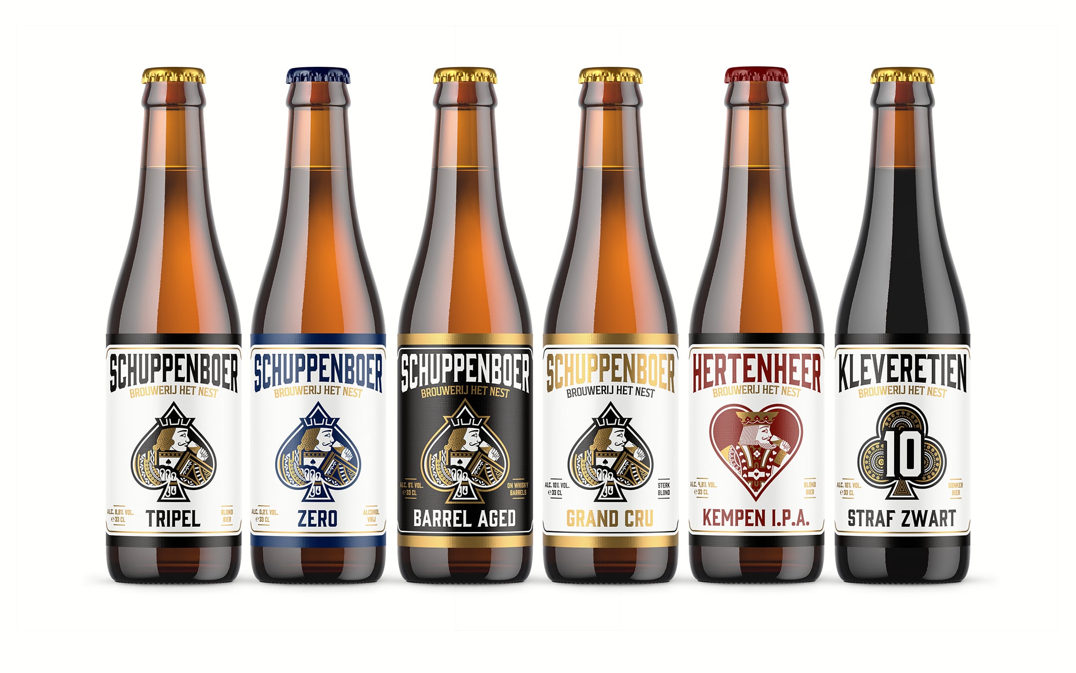
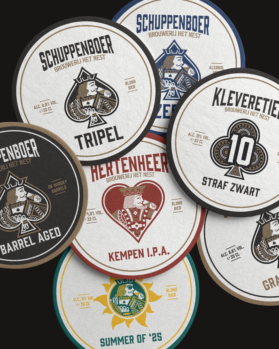
After years of success, it was time to redesign the label for Schuppenboer Tripel and several other core beers. The challenge was to create a more modern, refined look without losing the brewery’s historical ties and the playing card theme. The design needed to be scalable to other variants such as Schuppenboer Zero, Schuppenboer Grand Cru, Schuppenboer Barrel Aged, Hertenheer IPA, and De Kleverentien Donker.
Strategy:
Design with Respect for the Past
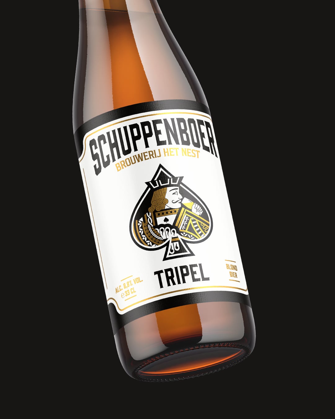
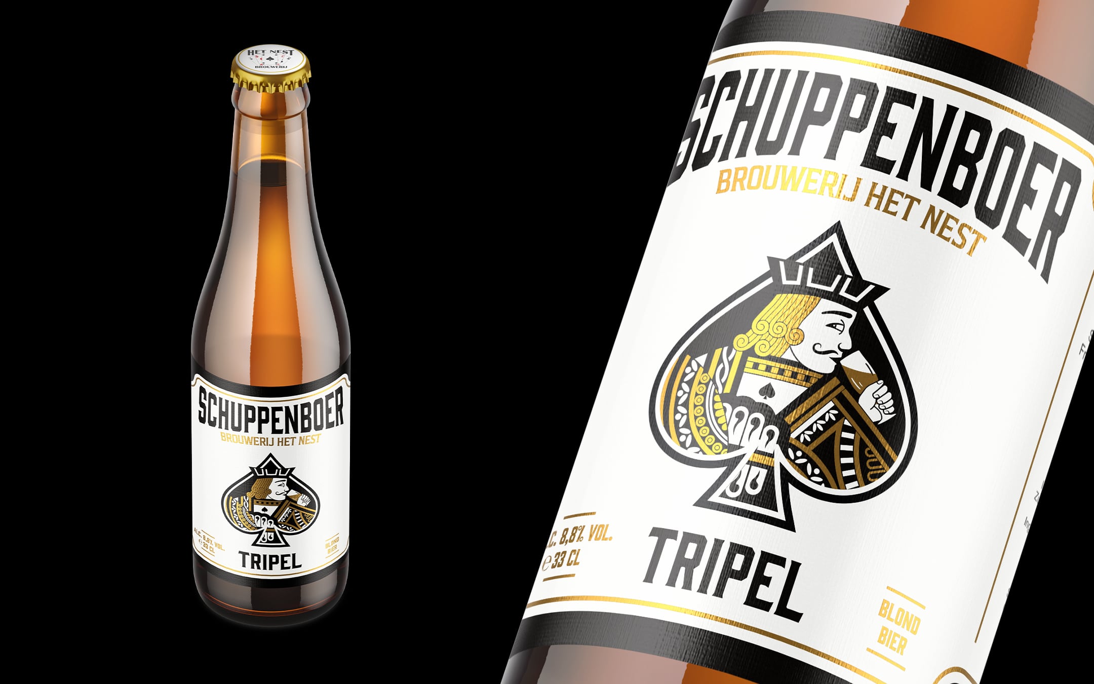
When designing the new label, we started with Schuppenboer Tripel while keeping in mind scalability for the other variants. The updated design is a modern nod to the original 2006 label, where the Jack of Spades was depicted holding a beer. We retained this iconic figure but modernized and refined it significantly. Additionally, the use of gold from previous labels was subtly integrated to maintain its premium feel.
Rock ‘n’ Roll Aesthetic
To emphasize the bold and powerful identity of Schuppenboer, we chose to limit the playing card color to black, creating a strong contrast that enhances the beer’s playful yet robust character.
Consistent Branding for the Full Line
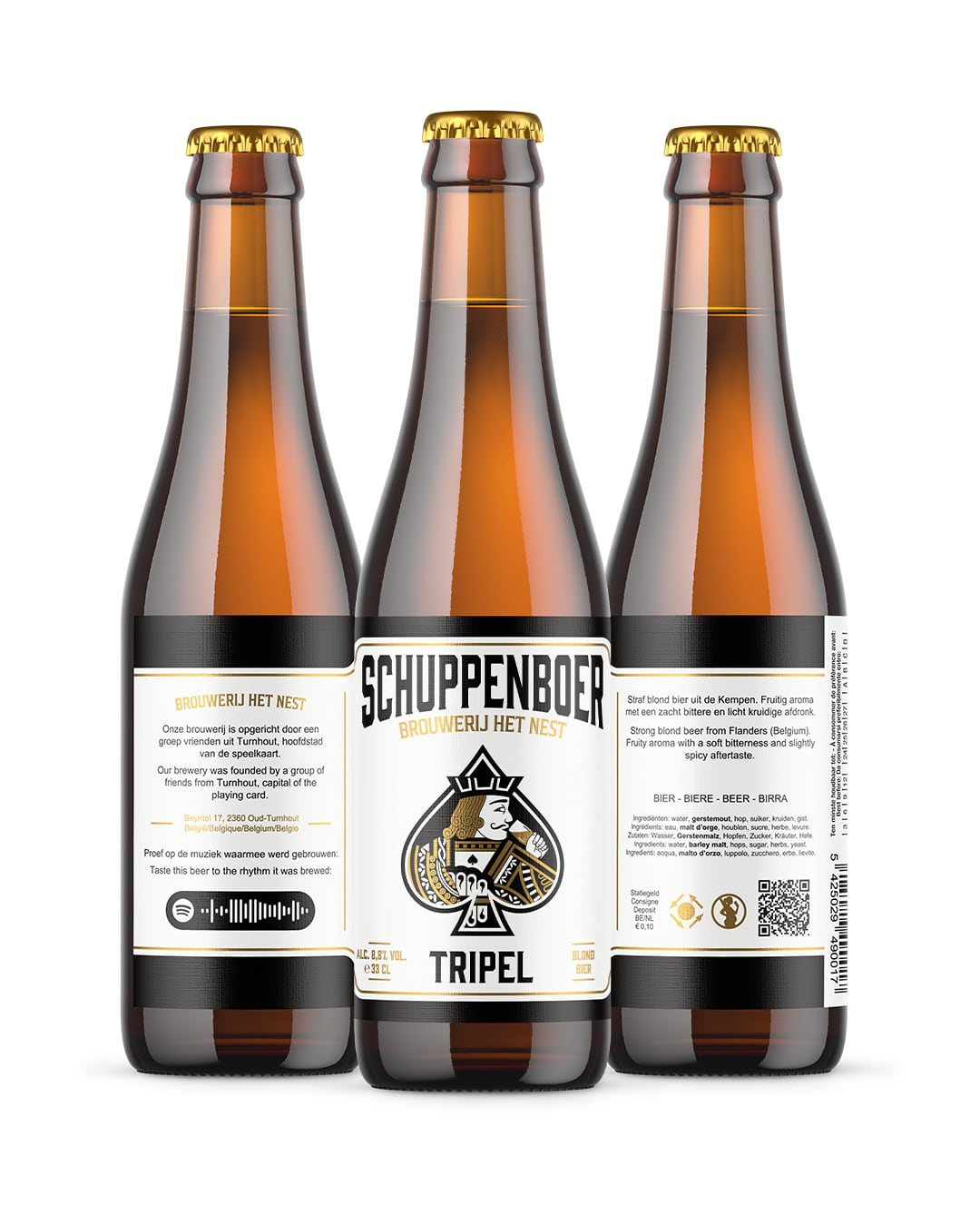
The new visual identity was extended across the entire line of core beers. Each beer received a unique twist within the overarching design, ensuring they remain recognizable as part of the Schuppenboer family while maintaining their distinct character.
Results:
Stronger Visual Identity: The redesigned beer line is more consistent and recognizable on the shelf.- Respect for History: The modern reinterpretation of the Jack of Spades retains the connection to the original design and Turnhout’s playing card heritage.
- Scalable Design: The flexible design allows for future beer variations to seamlessly integrate into the lineup.
The redesign of the Schuppenboer beer line demonstrates that tradition and modernity can go hand in hand. By reinterpreting historical elements and combining them with a contemporary graphic style, we have created a timeless and powerful design that is ready for the future.